Modern UI Speech Bubble Buttons Set: Clean, Versatile Interface Elements for Digital Projects
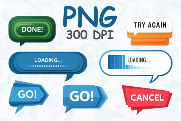
The Modern UI Speech Bubble Buttons Set offers a collection of 7 high-quality interface elements designed to enhance user interaction across a variety of digital environments. Each button—ranging from “Go” and “Cancel” to “Loading” and “Try Again”—is crafted with a modern aesthetic that blends clean lines, glossy finishes, and subtle layering. These speech bubble-style buttons are more than just functional UI components; they’re design assets that communicate clarity, responsiveness, and a sense of approachable professionalism.
Visually, the set leans into a contemporary design language with soft curves, balanced proportions, and carefully chosen color palettes that support both visibility and emotional tone. The transparent background allows for seamless integration into different interface layouts without disrupting the overall visual flow. Whether used in mobile apps, dashboards, or onboarding screens, these buttons provide a consistent visual cue that users can easily interpret and engage with.
Where These Speech Bubble Buttons Shine
One of the key strengths of the Modern UI Speech Bubble Buttons Set is its adaptability across a wide range of design contexts. Here are some of the most effective use cases:
- Mobile applications: These buttons work exceptionally well in mobile UIs where clarity and intuitive navigation are crucial. Their rounded, speech bubble shape feels familiar and approachable, making them ideal for in-app actions.
- Web design: Whether embedded in landing pages, modal windows, or notification banners, these buttons help guide user behavior with visual clarity and a modern touch.
- Digital dashboards: In data-heavy interfaces, these buttons offer a clean, non-intrusive way to manage actions without overwhelming the user.
- Games and interactive layouts: The playful yet professional look of these buttons makes them a great fit for game UIs, especially in tutorial prompts or in-game menus.
- Presentation and onboarding screens: When designing educational or onboarding flows, these buttons help maintain a cohesive and visually appealing experience.
Because each button is delivered as a high-resolution transparent PNG (5000 × 5000 px, 300 DPI), they can be easily layered into any background or layout without quality loss. This makes them a solid choice for both UI kits and design presentations where visual polish matters.
How These Buttons Impact Design and User Experience
In digital design, even small interface elements like buttons can have a significant impact on user engagement and brand perception. The Modern UI Speech Bubble Buttons Set contributes to a more cohesive and intuitive user experience in several ways:
- Visual hierarchy: The distinct shapes and color coding of each button help establish a clear visual hierarchy, allowing users to quickly identify actionable elements.
- Consistency: Using a unified set of buttons ensures a consistent look and feel across different screens and platforms, which enhances usability and reduces cognitive load.
- Professionalism: The refined edges and glossy finishes give these buttons a polished appearance that signals quality and attention to detail.
- Brand alignment: Depending on the color scheme and surrounding design elements, these buttons can be adapted to align with a brand’s visual identity, reinforcing recognition and trust.
- User engagement: Well-designed buttons not only look good but also encourage interaction. The friendly, speech-like shape of these buttons feels more inviting than rigid rectangular buttons.
Designers who incorporate these elements into their work will find that they support a more intentional and user-centered interface, especially in environments where clarity and responsiveness are essential.
Practical Tips for Using the Modern UI Speech Bubble Buttons Set
To get the most out of these interface elements, consider the following practical guidelines:
- Match the tone of your project: These buttons have a modern, slightly playful aesthetic. They work best in digital products that aim for a clean yet friendly interface—think productivity apps, lifestyle platforms, or creative tools.
- Test for readability and contrast: While the buttons are visually refined, it’s important to ensure sufficient contrast between the button and its background, especially for accessibility purposes.
- Pair with complementary UI elements: These buttons should feel like part of a larger design system. Use them alongside compatible icons, fonts, and layout structures to maintain harmony.
- Check licensing for commercial use: Since these assets are intended for both personal and commercial projects, verify the licensing terms to ensure compliance, especially when used in client work or digital products.
- Customize thoughtfully: Although the buttons are provided as static images, you can layer them with text or additional effects in design tools like Figma, Sketch, or Adobe XD to suit specific needs.
Designers should also consider how these buttons interact with other UI components. For example, if using a minimalist layout, these buttons can serve as visual anchors. In more complex interfaces, they can help break up visual clutter by offering clear, recognizable action points.
Final Thoughts
The Modern UI Speech Bubble Buttons Set is more than a decorative UI kit—it’s a functional design solution that supports better user interaction and visual consistency. Its modern style, high-quality rendering, and flexible application make it a valuable asset for web designers, app developers, and digital product creators alike. Whether you're building a new interface from scratch or refining an existing one, this set provides a polished, intuitive way to guide user actions and enhance the overall experience.